Home »
HTML
Bootstrap - Alerts and Wells
By IncludeHelp Last updated : October 25, 2024
In the previous article, we have discussed how to create a Responsive Image and Image shape? Now, in this article, we will discuss how to use .well and .alert element in bootstrap?
1) Well class
In bootstrap3 .well class is used to add a rounded border with grey background and padding around the element by default .well size is medium in size. .well class have some other classes from which we can change its size .well-sm and .well-lg class.
Note: The .well class is not available in bootstrap4.
2) Alert
The .alert class is used to create a feedback message which is displayed after specific actions led by the users. Alert class is available for any length of the text. Here, is some other classes to create an alert message i.e. .alert-* contextual classes to specify the kind of alert.
There are four typeof .alertcontextual class are available in bootstrap 3 ( .alert-success, .alert-info, .alert-warning, .alert-danger); but, in bootstrap 4 eight contextual classes are available ( .alert-success, .alert-info, .alert-warning, .alert-danger, .alert-primary, .alert-secondary, .alert-light, .alert-dark).
3) Alert link
We can create a link inside the alert box using <a> tag to match link contextual class color with the text.
4) Dismiss class
To close the alert message we use .close class and .data-dismiss elements (when you click on this the alert box will disappear)to a link or a button element in Bootstrap3. In bootstrap4 .alert-dismissible class is used which adds some extra padding to the right of the alert and positions the .close button as well as an optional dismiss button. You can also use aria-label="close" attribute when creating a dismiss link or button for people using screen readers.
Here, × is an HTML element which is used for close icons (x). To create animated alerts when dismissing them, add the .fade and .show classes in bootstrap 4 .fade and .in class in bootstrap 3 for animated alerts (Used for a fading effect when closing the alert message). When the user clicks the Close button, the alert disappears.
5) Alert heading
Alerts can also contain additional HTML elements headings, paragraphs and dividers.
Example for Alerts and Wells in Bootstrap
<!doctype html>
<html lang="en">
<head>
<title>Bootstrap Alerts and Wells</title>
<meta charset="utf-8">
<meta name="viewport" content="width=device-width, initial-scale=1">
<!-- Bootstrap CSS CDN for Bootstrap 3 -->
<link rel="stylesheet" href="https://maxcdn.bootstrapcdn.com/bootstrap/3.4.1/css/bootstrap.min.css">
</head>
<body>
<div class="container mt-5">
<h2>Using Well Element in Bootstrap</h2>
<!------- Use of Well Element ------------>
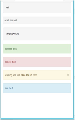
<div class="well">Default Well</div>
<div class="well well-sm">Small Size Well</div>
<div class="well well-lg">Large Size Well</div>
</div>
<div class="container mt-5">
<h2>Using Alert Element in Bootstrap</h2>
<!------- Use of Alert Element ------------>
<div class="alert alert-success">Success Alert</div>
<div class="alert alert-danger">Danger Alert</div>
<div class="alert alert-warning fade in">
<a href="#" class="close" data-dismiss="alert" aria-label="close">×</a>
Warning alert with <strong>.fade and .in</strong> class
</div>
<div class="alert alert-info">Info Alert</div>
</div>
<!-- jQuery and Bootstrap JS CDN -->
<script src="https://ajax.googleapis.com/ajax/libs/jquery/1.12.4/jquery.min.js"></script>
<script src="https://maxcdn.bootstrapcdn.com/bootstrap/3.4.1/js/bootstrap.min.js"></script>
</body>
</html>
Result
Output - Mobile View
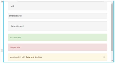
Output - Tablet View
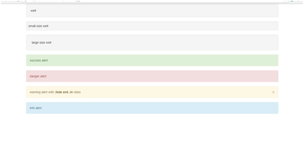
Output - Desktop View
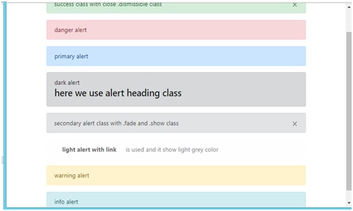
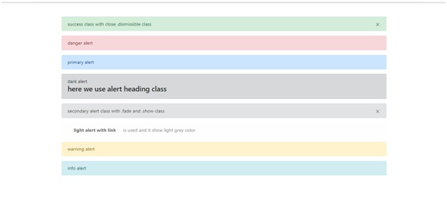
Example in Bootstrap4
<!doctype html>
<html lang="en">
<head>
<title>Bootstrap Alerts</title>
<meta charset="utf-8">
<meta name="viewport" content="width=device-width, initial-scale=1">
<!-- Bootstrap CSS CDN -->
<link rel="stylesheet" href="https://stackpath.bootstrapcdn.com/bootstrap/4.1.3/css/bootstrap.min.css">
</head>
<body>
<div class="container mt-5">
<h2>Bootstrap Alerts Example</h2>
<!-- Success Alert -->
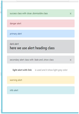
<div class="alert alert-success alert-dismissible fade show" role="alert">
Success class with close .dismissible class
<button type="button" class="close" data-dismiss="alert" aria-label="Close">
<span aria-hidden="true">×</span>
</button>
</div>
<!-- Danger Alert -->
<div class="alert alert-danger" role="alert">
Danger alert
</div>
<!-- Primary Alert -->
<div class="alert alert-primary" role="alert">
Primary alert
</div>
<!-- Dark Alert -->
<div class="alert alert-dark" role="alert">
Dark alert
<h4 class="alert-heading">Here we use the alert-heading class</h4>
</div>
<!-- Secondary Alert -->
<div class="alert alert-secondary alert-dismissible fade show" role="alert">
Secondary alert class with .fade and .show class
<button type="button" class="close" data-dismiss="alert" aria-label="Close">
<span aria-hidden="true">×</span>
</button>
</div>
<!-- Light Alert -->
<div class="alert alert-light" role="alert">
<a href="#" class="alert alert-link">Light alert with link</a>
is used and it shows light grey color.
</div>
<!-- Warning Alert -->
<div class="alert alert-warning" role="alert">
Warning alert
</div>
<!-- Info Alert -->
<div class="alert alert-info" role="alert">
Info alert
</div>
</div>
<!-- jQuery and Bootstrap JS CDN -->
<script src="https://code.jquery.com/jquery-3.3.1.slim.min.js"></script>
<script src="https://cdnjs.cloudflare.com/ajax/libs/popper.js/1.14.7/umd/popper.min.js"></script>
<script src="https://stackpath.bootstrapcdn.com/bootstrap/4.1.3/js/bootstrap.min.js"></script>
</body>
</html>
Result
Output - Mobile View
Output - Tablet View
Output - Desktop View
Conclusion
In this article, we have learnt how to use .well, .alert and its different classes? I hope now you will understand the whole concept behind it.
Advertisement
Advertisement