Home »
HTML
Bootstrap - Jumbotron and Page Header Classes
By IncludeHelp Last updated : October 25, 2024
Introduction
In the previous article, we have learned how Responsive column, Nesting Columns and offset Columns work and how to use them? I hope now, you all are comfortable with the grid system; what is it, how to use it and how we can use it for creating a responsive page. Now, in this article, we’ll see how .Jumbotron class works and what is it, and know more about .page-header class. If you have any doubt, feel free to ask in the comment section.
Bootstrap jumbotron Class
It is like a big grey box. we can use this .jumbotron class to highlight some special piece of information and to focus on visitor's attention; where the content size of heading increases and it adds a lot of margins. We can use any HTML, CSS tags, elements and any style, including bootstrap elements and classes inside it. To use .jumbotron class you have to use a <div> element with .jumbotron class.
If you use .container and .container-fluid class, then you can also use .jumbotron class inside and outside the .container and .container-fluid class where .container-fluid occupies the entire horizontal space.
We can use this .jumbotron for presentation, images, Articles, blogs, New Posts etc.
Example
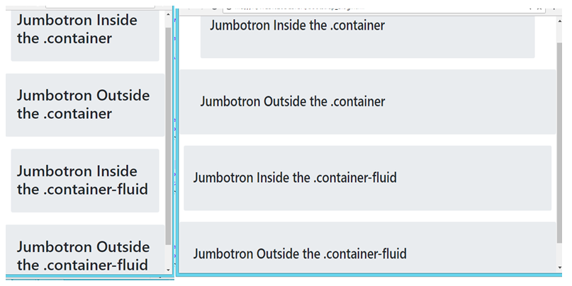
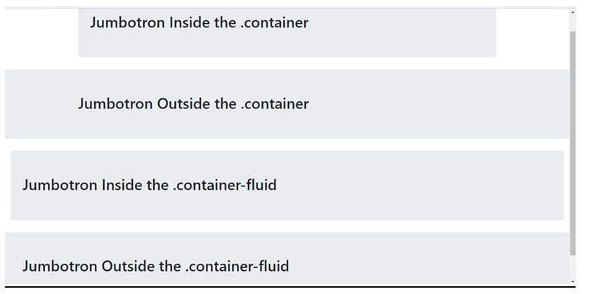
This example demonstrates the use of Bootstrap's grid system by displaying jumbotrons both inside and outside of .container and .container-fluid classes to show how layout responsiveness varies with different container types.
<div class="container">
  <div class="jumbotron">
    <h1>Jumbotron Inside the .container</h1>
  </div>
</div>
<div class="container">
  <div class="jumbotron">
    <h1>Jumbotron Outside the .container</h1>
  </div>
</div>
<div class="container-fluid">
  <div class="jumbotron">
    <h1>Jumbotron Inside the .container-fluid</h1>
  </div>
</div>
<div class="container-fluid">
  <div class="jumbotron">
    <h1>Jumbotron Outside the .container-fluid</h1>
  </div>
</div>
Result
Mobile and Tablet View
Desktop View
jumbotron Class with jumbotron-fluid
You can also use .Jumbotron-fluid class with .container and .container-fluid for full width jumbotron. It works similarly to .container-fluid class works for full width. There is not much difference between them.
Syntax
<div class="jumbotron jumbotron-fluid">
Bootstrap page-header Class (Creating a Page Header)
There is also a another class .page-header class, .page-header class mainly work in bootstrap 3, not in bootstrap 4... just like .jumbotron class that creates a big grey box; same as .page-header class, add a horizontal line and add some extra spaces. It is like a section divider; Use <div> for .page-header class.
Example
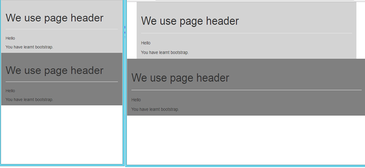
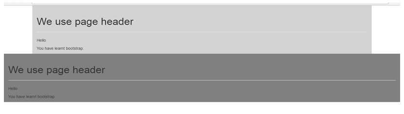
This example creates two sections: one with a light grey background and fixed width using .container, and another with a grey background and full width using .container-fluid, both featuring a page header and two paragraphs of text.
<div class="container" style="background-color: lightgrey; padding: 20px;">
  <div class="page-header">
    <h1>We use page header</h1>
  </div>
  <p>Hello</p>
  <p>You have learned Bootstrap.</p>
</div>
<div class="container-fluid" style="background-color: grey; padding: 20px;">
  <div class="page-header">
    <h1>We use page header</h1>
  </div>
  <p>Hello</p>
  <p>You have learned Bootstrap.</p>
</div>
Result
Mobile and Tablet view
Desktop view
Conclusion
So, In this article we have learnt about .jumbotron, .jumbotron-fluid and .page-header class. In this next article, we will learn about what is typography and how it is used. See you soon in the next article! Happy Learning!
Advertisement
Advertisement