Home »
HTML
How to use Bootstrap Grid System?
By IncludeHelp Last updated : October 24, 2024
In the last article, we learned how to create a simple page of Bootstrap? Now, we will learn what is "Grid System" in Bootstrap and how we can use or implement it in our bootstrap page? As you know bootstrap is a mobile-friendly framework. So, we design our responsive page for 'mobile first fluid grid system' and it automatically, adjust its view in every system. Now, we move further and know more about this. If you have any doubt, ask in the comment section.
What is Grid?
A grid is a 2-D structure where rows and columns are used to structure the content. It is widely used to create a structure and for layout use HTML and CSS which make it easy to use, scan and to reduce the comprehension load on users.
Grid System
In Bootstrap Grid System it scales up to 12 columns as the device or viewport size increases. It includes predefined classes for easy layout. Basically, Grid systems are used for creating page layouts through a series of rows and columns. It’s up to you how many columns individually you want to use in your page and how many columns group you want.
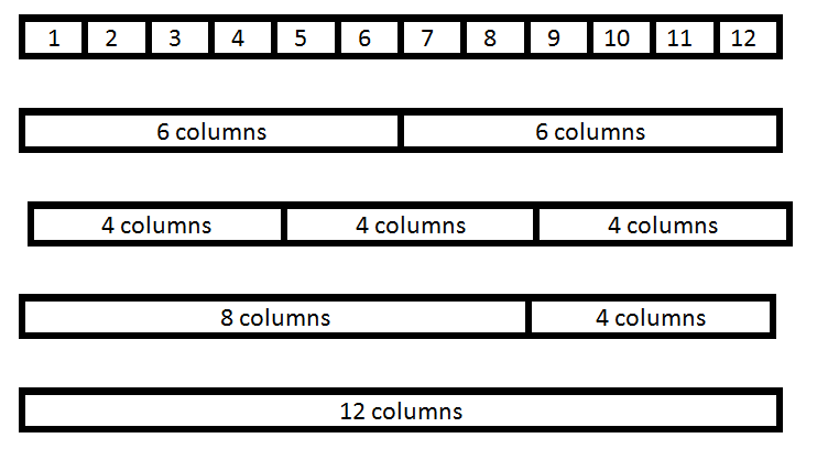
Example
The image below showcases various layout options using the Bootstrap Grid System, illustrating how content can be structured across different column configurations for responsive design.
Working of Grid System
- We use .container class (for fixed width) and .container-fluid class (for full width: 100%) to place the rows.
- There are .row and col-*-* pre-defined classes are available for layout. It will automatically set the width from the small breakpoint.
Note: Here, Astric ( * ) is for xs (for extra small device phone, <576px) , sm (for small device tablet, >= 768px), md (for desktop, >= 992px) , lg (for larger desktops, >= 1200px) and for the number of columns you want like: col-sm-4.
- Use row for a group of columns because .row is a pre-defined wrapper class for col-*-*.
- Each .row and .col-*-* has horizontal padding for controlling the space between them called Gutters. That padding is offset in rows for the first and the last column via negative margin on .rows.
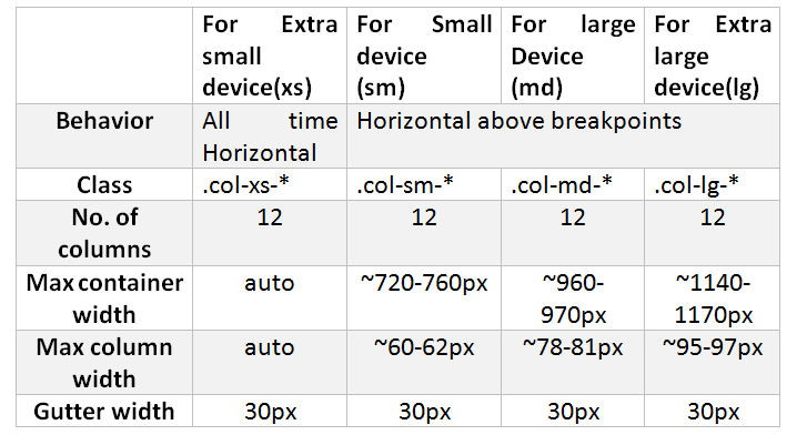
Grid Options
The image below showcases various Grid Options in Bootstrap, illustrating how different column configurations can be used to create responsive and flexible layouts.
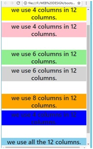
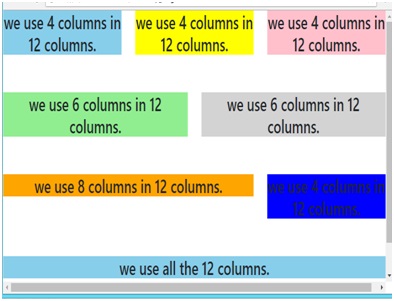
Example of Bootstrap Grid System
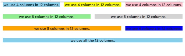
This example demonstrates the use of Bootstrap's grid system to create responsive layouts with different column configurations, including examples of 4, 6, 8, and 12-column divisions, along with centered headings and background colors for each section.
<!DOCTYPE html>
<html lang="en">
  <head>
    <meta charset="UTF-8">
    <meta name="viewport" content="width=device-width, initial-scale=1.0">
    <title>Bootstrap Grid Example</title>
    <!-- Link to Bootstrap CSS -->
    <link href="https://cdn.jsdelivr.net/npm/[email protected]/dist/css/bootstrap.min.css" rel="stylesheet">
  </head>
  <body>
    <!---------- First type of grid ---------->
    <div class="container">
      <div class="row">
        <div class="col-sm-4">
          <h3 class="text-center" style="background-color:skyblue;">We use 4 columns in 12 columns.</h3>
        </div>
        <div class="col-sm-4">
          <h3 class="text-center" style="background-color:yellow;">We use 4 columns in 12 columns.</h3>
        </div>
        <div class="col-sm-4">
          <h3 class="text-center" style="background-color:pink;">We use 4 columns in 12 columns.</h3>
        </div>
      </div>
    </div>
    <br /><br />
    <!----------- Second grid type -------------->
    <div class="container">
      <div class="row">
        <div class="col-sm-6">
          <h3 class="text-center" style="background-color:lightgreen;">We use 6 columns in 12 columns.</h3>
        </div>
        <div class="col-sm-6">
          <h3 class="text-center" style="background-color:lightgrey;">We use 6 columns in 12 columns.</h3>
        </div>
      </div>
    </div>
    <br /><br />
    <!----------- Third grid type -------------->
    <div class="container">
      <div class="row">
        <div class="col-sm-8">
          <h3 class="text-center" style="background-color:orange;">We use 8 columns in 12 columns.</h3>
        </div>
        <div class="col-sm-4">
          <h3 class="text-center" style="background-color:blue;">We use 4 columns in 12 columns.</h3>
        </div>
      </div>
    </div>
    <br /><br />
    <!----------- Fourth grid type -------------->
    <div class="container">
      <div class="row">
        <div class="col-sm-12">
          <h3 class="text-center" style="background-color:skyblue;">We use all the 12 columns.</h3>
        </div>
      </div>
    </div>
    <br /><br />
    <!-- Link to Bootstrap JS -->
    <script src="https://cdn.jsdelivr.net/npm/[email protected]/dist/js/bootstrap.bundle.min.js"></script>
  </body>
</html>
Result
Mobile View
Tablet View
Desktop View
Advertisement
Advertisement