Home »
HTML
Create Responsive Parallax Animation with Bootstrap
By IncludeHelp Last updated : October 22, 2024
Bootstrap used here is for making the pages responsive so that it looks good in all screen sizes whether it will be mobile, laptop etc. We will make use of HTML to make structure of website and CSS for styling the website.
Firstly, we will know what is parallax?
What is Parallax?
Parallax is very famous trends of website used nowadays in which background image moved at a different pace then the foreground content while scrolling.
Initial Setup
Then we will make a container element having a background image with some fixed height to create a scrolling effect.
We have to use background-attachment: fixed property to create a parallax effect while scrolling. If we remove that property so our parallax effect will get disabled.
Complete Code to Create Responsive Parallax Animation with Bootstrap
1. HTML Code
<!DOCTYPE html>
<html>
  <head>
    <title>Parallax Effect</title>
    <meta charset="utf-8">
    <meta name="viewport" content="width=device-width,initial-scale=1.0">
    <meta http-equiv="X-UA-Compatible" content="IE=Edge">
    <link rel="stylesheet" href="https://maxcdn.bootstrapcdn.com/bootstrap/3.3.7/css/bootstrap.min.css">
    <link rel="stylesheet" href="https://cdnjs.cloudflare.com/ajax/libs/font-awesome/4.7.0/css/font-awesome.min.css">
    <script src="https://ajax.googleapis.com/ajax/libs/jquery/3.2.1/jquery.min.js"></script>
    <script src="https://maxcdn.bootstrapcdn.com/bootstrap/3.3.7/js/bootstrap.min.js"></script>
    <link href="css/style.css" type="text/css" rel="stylesheet">
  </head>
  <body>
    <div class="container-fluid home">
      <h1>Welcome to Parallax Effect</h1>
      <p>Enjoy It And Try It</p>
    </div>
    <div class="container-fluid aboutus">
      <div class="row">
        <div class="col-lg-6 col-md-6 col-sm-6 col-xs-6 aboutbox">
          <h4>We are Development Company</h4>
          <p>Lorem Ipsum is simply dummy text of the printing and typesetting industry. Lorem Ipsum has been the industry's standard dummy text ever since the 1500s, when an unknown printer took a galley of type and scrambled it to make a type specimen book. It has survived not only five centuries, but also the leap into electronic typesetting, remaining essentially unchanged. </p>
        </div>
      </div>
    </div>
  </body>
</html>
2. CSS Code
@import url('https://fonts.googleapis.com/css?family=Kaushan+Script');

body {
  margin: 0px;
  padding: 0px;
  font-family: 'Kaushan Script', cursive;
  color: #ddd;
  font-size: 14px;
  overflow-x: hidden;
}

.home {
  padding: 0px;
  background-image: url(../images/img1.jpeg);
  background-attachment: fixed;
  min-height: 700px;
  background-size: cover;
  background-repeat: no-repeat;
  background-color: #000;
  opacity: 1.2;
}

.home h1 {
  font-size: 80px;
  font-weight: bold;
  color: #ffeb0a;
  ;
  position: absolute;
  top: 40%;
  left: 17%;
}

.home p {
  font-size: 40px;
  color: #ffeb0a;
  ;
  position: absolute;
  top: 72%;
  left: 41%;
}

.aboutus {
  padding: 0px;
  background-image: url(../images/img2.jpeg);
  background-attachment: fixed;
  min-height: 500px;
  background-size: cover;
  background-repeat: no-repeat;
  opacity: 0.5;

}

.aboutbox {
  background: #242aee;
  ;
  padding: 15px;
  text-align: center;
}

.aboutbox h4 {
  background: black;
  color: white;
  font-size: 30px;
  font-weight: bold;
}

@media only screen and (max-width:768px) {
  .home h1 {
    font-size: 30px;
  }

  .home p {
    font-size: 18px;
  }
}
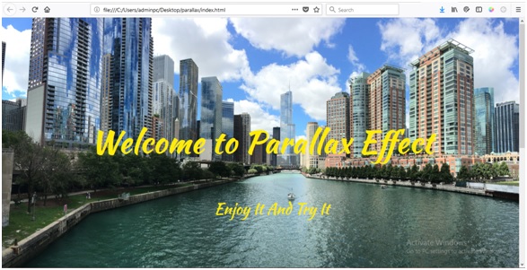
Output

Advertisement
Advertisement