Home »
Python »
Python Data Visualization
Python | Dual Histogram Plot
Dual Histogram Plot in Python. In this tutorial, we will learn about the dual histogram plot and its Python implementation.
By Anuj Singh Last updated : August 18, 2023
Dual Histogram Plot
A histogram is a graphical technique or a type of data representation using bars of different heights such that each bar group's numbers into ranges (bins or buckets). Taller the bar higher the data falls in that bin. A Histogram is one of the most used techniques in data visualization and therefore, matplotlib has provided a function matplotlib.pyplot.hist() for plotting histograms. A dual histogram is a type of histogram in which we can plot a histogram of two data sets. It is often used for dual data comparison and classification.
Example
The following example illustrates the implementation and use of the Dual Histogram Plot.
Python program for dual histogram plot
import matplotlib.pyplot as plt
import numpy as np
# random data generation
mu, sigma = 100, 15
x = mu + sigma * np.random.randn(10000)
mu_w = 200
sigma_w = 10
w = np.random.normal(mu_w, sigma_w, size=100)
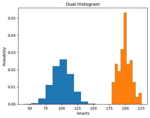
# Histogram of the Data
plt.figure()
plt.hist(x, density=True, histtype='barstacked', rwidth=1)
plt.hist(w, density=True, histtype='barstacked', rwidth=1)
plt.title('barstacked')
plt.xlabel('Smarts')
plt.ylabel('Probability')
plt.title('Dual Histogram')
plt.show()
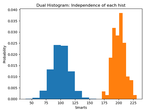
plt.figure()
plt.hist(x, density=True, histtype='barstacked', rwidth=1)
plt.hist(w, bins=10, density=True, histtype='barstacked', rwidth=1)
plt.xlabel('Smarts')
plt.ylabel('Probability')
plt.title('Dual Histogram: Independence of each hist')
plt.show()
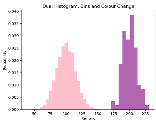
plt.figure()
plt.hist(x, bins=25, color='pink', density=True, histtype='barstacked', rwidth=1)
plt.hist(w, bins=10, color='purple', alpha=0.6, density=True, histtype='barstacked', rwidth=1)
plt.xlabel('Smarts')
plt.ylabel('Probability')
plt.title('Dual Histogram: Bins and Colour Change')
plt.show()
Output:
Output is as figure
Advertisement
Advertisement