Home »
Python »
Python Data Visualization
Python | Bar Graph
Python | Bar Graph: In this tutorial, we are going to learn about the bar graph and its implementation with examples.
By Anuj Singh Last updated : August 18, 2023
Bar Graph
A bar graph is a type of data visualization technique that is very often used to represent data in the form of a vertical bar. The height of the bar is proportional to the value. They allow us to compare data very clearly and therefore, bar graphs or bar charts are included in most of the presentations worldwide. A bar graph can be used to show comparisons between discrete classes and one of the two axes represents the specific categories that are being compared, and the other axis represents a measured value (for most of the cases, the y-axis represents the value and x-axis consist of discrete classes).
matplotlib allows us to use this particular class of data visualization via an inbuilt function matplotlib.bar().
The following are examples for understanding the implementation of bar graphs.
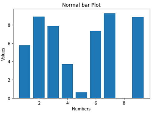
1) Standard Bar Graph
Syntax:
plt.bar(x, y)
- x - x axis distribution
- y - height of the bar
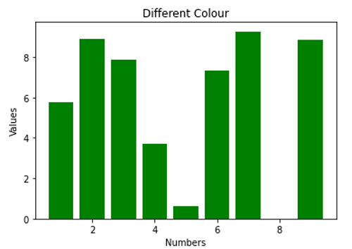
2) Standard Bar Graph with Color Change (Green)
Syntax:
plt.bar(x, y, color='g')
- color='g' - green color bars
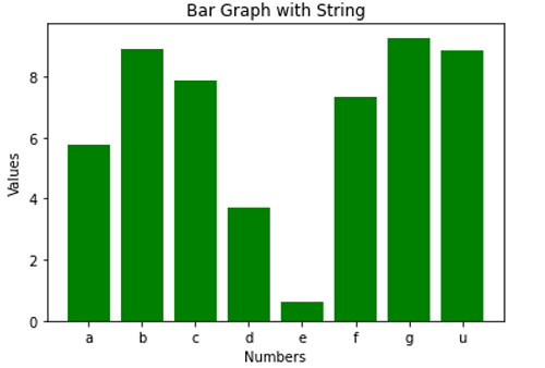
3) Bar Graph with String
Syntax:
xx = np.array(['a','b','c','d','e','f','g','u'])
plt.bar(xx, y, color='g')
- xx - using names instead of numeric values on individual bar
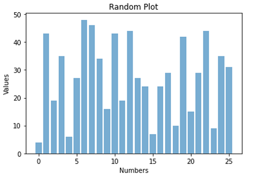
4) A Random Bar graph with using opaque ratio
Syntax:
plt.bar(np.arange(26), np.random.randint(0,50,26), alpha = 0.6)
- alpha=0.6 - opaque ratio as 0.6
Python code to demonstrate example of bar graph
# Data Visualization using Python
# Bar Graph

import numpy as np
import matplotlib.pyplot as plt

N = 8
x = np.array([1,2,3,4,5,6,7,9])
xx = np.array(['a','b','c','d','e','f','g','u'])
y = np.random.rand(N)*10

# a normal bar plot with default features
plt.bar(x, y)
plt.xlabel('Numbers')
plt.ylabel('Values')
plt.title('Normal bar Plot')
plt.show()

# a bar plot with green collour
plt.figure()
plt.bar(x, y, color='g')
plt.xlabel('Numbers')
plt.ylabel('Values')
plt.title('Different Colour')
plt.show()

# a bar plot with string points
plt.figure()
plt.bar(xx, y, color='g')
plt.xlabel('Numbers')
plt.ylabel('Values')
plt.title('Bar Graph with String')
plt.show()

# a combined bar Plot
plt.figure()
plt.bar(np.arange(26), np.random.randint(0,50,26), alpha = 0.6)
plt.xlabel('Numbers')
plt.ylabel('Values')
plt.title('Random Plot')
plt.show()
Output:
Output is as figure
Advertisement
Advertisement