Home »
Python »
Python Data Visualization
Python | Scatter Plots
Python | Scatter Plot: In this tutorial, we are going to learn about the scatter plot and its implementation with examples.
By Anuj Singh Last updated : August 18, 2023
Scatter Plots
Inherited from the Dot Plots, Scatter plots are of very similar types. It provides a power of different features for every individual point. We are allowed to vary the size, color, and other properties of each data point and which makes data more friendly to visualize.
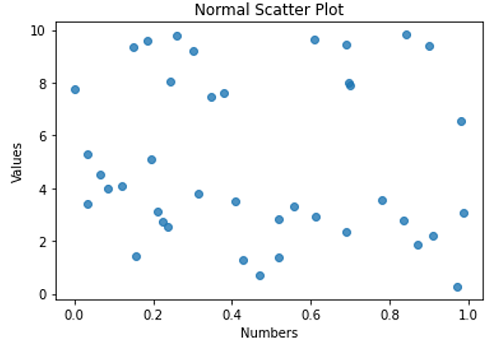
Normal Scatter Plot
Syntax
plt.scatter(x, y, alpha=0.8)
Parameter(s)
- x, y - data points in an array
- Alpha = 0.8 - opaque value (0 for transparent and 1 for opaque)
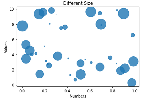
Scatter Plot with variable size
Syntax
plt.scatter(x, y, s=area, alpha=0.8)
Parameter(s)
- x, y - data points in an array
- Alpha = 0.8 - opaque value (0 for transparent and 1 for opaque)
- s = area - the size of each point in terms of area
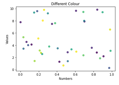
Dash Point Plots with color code Green, Red, Blue Yellow
Syntax
plt.scatter(x, y, c=colors, alpha=0.8)
Parameter(s)
- x, y - data points in an array
- Alpha = 0.8 - opaque value (0 for transparent and 1 for opaque)
- c = colors - colors of each point
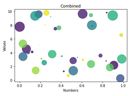
Star Point Plot with Color Code Blue, Green, Red, Yellow
Syntax
plt.scatter(x, y, c=colors, s=area, alpha=0.8)
Parameter(s)
- x, y - data points in an array
- Alpha = 0.8 - opaque value (0 for transparent and 1 for opaque)
- c = colors - colors of each point
- s = area - size of each point in terms of area
Python program to demonstrate example of scatter plot
import numpy as np
import matplotlib.pyplot as plt

N = 40
x = np.random.rand(N)
y = np.random.rand(N)*10

# random colour for points, vector of length N
colors = np.random.rand(N)

# area of the circle, vectoe of length N
area = (30 * np.random.rand(N))**2
# 0 to 15 point radii

# a normal scatter plot with default features
plt.scatter(x, y, alpha=0.8)
plt.xlabel('Numbers')
plt.ylabel('Values')
plt.title('Normal Scatter Plot')
plt.show()

# a scater plot with different size
plt.figure()
plt.scatter(x, y, s=area, alpha=0.8)
plt.xlabel('Numbers')
plt.ylabel('Values')
plt.title('Different Size')
plt.show()

# a scatter plot with different collour
plt.figure()
plt.scatter(x, y, c=colors, alpha=0.8)
plt.xlabel('Numbers')
plt.ylabel('Values')
plt.title('Different Colour')
plt.show()

# A combined Scatter Plot
plt.figure()
plt.scatter(x, y, s=area, c=colors, alpha=0.8)
plt.xlabel('Numbers')
plt.ylabel('Values')
plt.title('Combined')
plt.show()
Output:
Output is as figure
Applications of Python Scatter Plots
- Machine Learning
- Monte Carlo Simulation
- Case Studies
- Probabilistic Models
Advertisement
Advertisement