Home »
Python »
Python Data Visualization
Python | Pie Chart
Pie Chart in Python. Here, we are going to learn about the Pie Chart and its Python implementation.
By Anuj Singh Last updated : August 18, 2023
Pie Plot or a Pie Chart
A pie plot or a pie chart is a circular statistical graphic technique, in which a circle is divided into slices with respect to numerical proportion. In a pie chart, the arc length, central angle, and area of each slice, is proportional to the quantity it represents. The sum of the total is always equal to 100 percent in the basic pie chart.
matplotlib.pyplot.pie() Method
The name pie in the pie plot is derived for its resemblance to a pie that has been sliced. Pie charts are very widely used in the different types of projects and business world. Matplotlib has a defined function in matplotlib.pyplot.pie() for plotting a pie chart.
Syntax
matplotlib.pyplot.pie(sizes, labels=labels, autopct='%1.1f%%')
#Square textbox style
Example
Python program for pie chart
# Data Visualization using Python
# Pie Chart
import matplotlib.pyplot as plt
# Pie chart, where the slices will be ordered
# and plotted counter-clockwise:
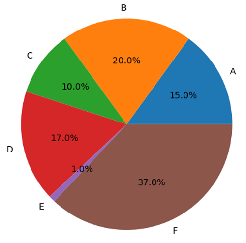
labels = 'A', 'B', 'C', 'D', 'E', 'F'
sizes = [15, 20, 10, 17, 1, 37]
plt.figure()
plt.pie(sizes, labels=labels, autopct='%1.1f%%')
# Equal aspect ratio ensures that pie is drawn
# as a circle.
plt.axis('equal')
plt.show()
Output:
Output is as figure
Advertisement
Advertisement